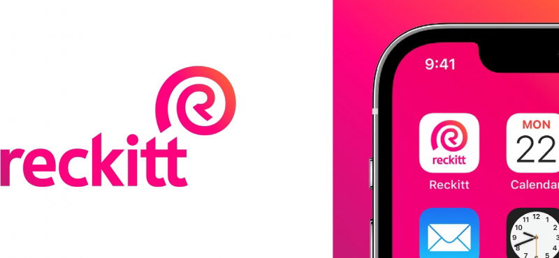
Durex parent firm Reckitt Benckiser rebrands as Reckitt, creates bespoke typeface
share on
Reckitt Benckiser has rebranded to Reckitt, featuring a new logo and colour palette, bespoke typography and photography. Done in partnership with Havas' branding agency Conran Design Group, the rebrand will roll out across all of Reckitt's touchpoints and platforms - internal and external as well as physical and digital.
At the heart of the new logo is an "R" which stands for the company's unity, strength and relentless pursuit, inspired by Reckitt’s purpose to protect, heal and nurture. It also denotes Reckitt’s role in the world as a partner and a catalyst for positive transformation. The shell-like quality of the symbol evokes a sense of protection and a reference to the natural world, and features its new, bespoke typeface "Energy".
Miguel Veiga-Pestana, SVP corporate affairs and sustainability, explained that the name reflects the existing widespread usage of Reckitt and is clearer, simpler and more memorable, while retaining positive associations with the company’s heritage.


The evolved colour palette features a highly distinctive and recognisable energy pink which is Reckitt's primary brand colour, signifying its perpetual brand energy. Meanwhile, the secondary colours reflect its portfolio of products and connection to a cleaner, healthier world.

At the same time, Reckitt will also feature authentic, accessible and active imagery moving forward to showcase how change starts with an individual, the tangible impact Reckitt has on people’s lives, the strength of its partnerships and its understanding of a changing world. MARKETING-INTERACTIVE has reached out to Reckitt for comment.

According to Jo Osborn, VP, internal communications and corporate brand, the new identity will better enable it to communicate its corporate purpose to the world, and to do so in a way that is "powerful, consistent and impactful".
Meanwhile, Thom Newton, CEO, Conran Design Group said the new branding reflects Reckitt's 200-year history and offers an active expression of its purpose and ambition. "The opportunity to work with the company to redevelop and launch the new brand was an opportunity we relished.
Reckitt manufactures a list of well known brands including Air Wick, Clearasil, Dettol, Durex, Enfa, Veet and Strepsils, among others. It has more than 43,000 employees globally and seeks to protect, heal and nurture in its pursuit of a cleaner, healthier world. In February, Boston-based private equity firm Yellow Wood Partners announced that it is acquiring the Scholl footcare brand from Reckitt. The acquisition will reunite Scholl with the Dr. Scholl's brand as one entity after 30+ years of separate ownership.
The Dr. Scholl's brand is present at major bricks and mortar and ecommerce retailers in the US. Similarly, the Scholl brand is also present in various regions such as France, Italy, Germany, the UK, Australia and many other markets outside of North America. In addition to its footcare products, the Scholl brand provides a diversified portfolio of skin care products, insoles, and treatment solutions for targeted foot conditions. According to Yellow Wood Partners, the combination of Scholl and Dr. Scholl's will create a global footcare brand operating in more than 50 countries as an integrated business.
share on
Free newsletter
Get the daily lowdown on Asia's top marketing stories.
We break down the big and messy topics of the day so you're updated on the most important developments in Asia's marketing development – for free.
subscribe now open in new window
